Empty Entryways Are Costing You Offers: How Virtual Staging Fixes the Most Ignored First Impression in Real Estate
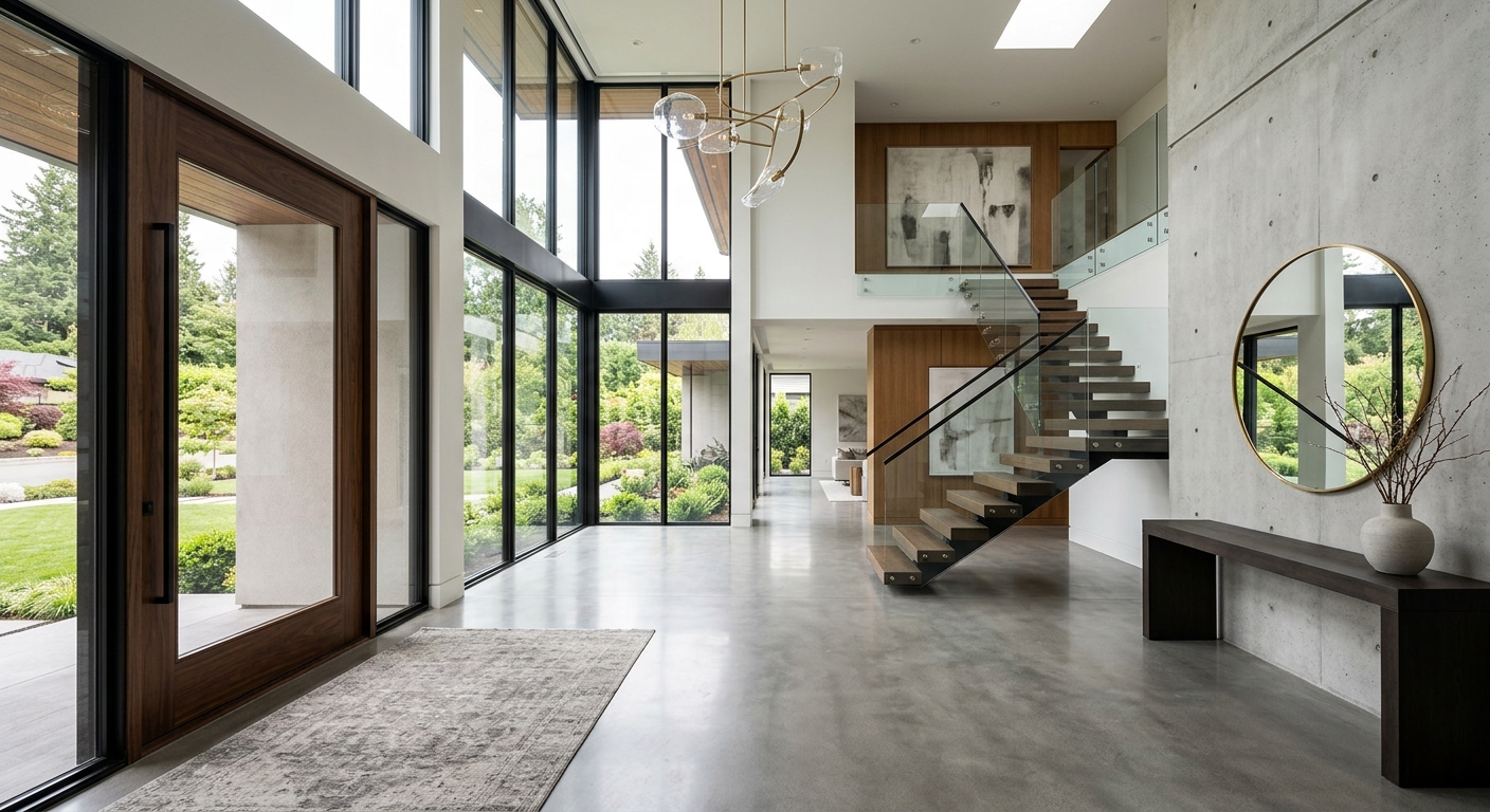
Everybody obsesses over kitchens, primary bedrooms, and whether the living room looks expensive enough to justify the asking price. Fair. Those rooms matter. But the most ignored space in listing photography is often the one that quietly sets the tone for everything else: the entryway. When buyers click into a listing, scroll past the exterior shot, and land on an interior image, they are already deciding what kind of home they think they are entering. If that first interior moment is a blank foyer with white walls, echo-chamber lighting, and the emotional range of a tax form, you’ve started uphill.
This is where virtual staging earns its keep. Not the cheesy kind that looks like a furniture catalog exploded in the hallway, but the strategic kind that gives buyers visual context, creates flow, and makes the transition into the home feel intentional. A well-staged entryway tells a buyer, this home has a point of view. It also helps the rest of the property feel more coherent, because first impressions do what first impressions always do: they contaminate everything that follows.
For real estate teams using modern tools, this is also where a platform like Staging Wizard becomes more than a gimmick with a pretty interface. Features like Vision Builder, Vibe Staging, and Magic Motion are unusually useful in transitional spaces because they help shape mood, scale, and movement in rooms that buyers don’t naturally know how to interpret.
Why vacant entryways fail so often
An empty entryway is technically clean, but visually useless. Buyers rarely know what to do with it. Is it a drop zone? A luxury arrival moment? A practical family corridor? A narrow pass-through with just enough room for a bench and art? In a furnished home, those questions answer themselves. In a vacant one, the buyer has to do all the interpretive labor. Most won’t. They’ll just feel that something is missing.
That missing feeling matters because the entryway acts as the home’s opening sentence. If it feels cold, cramped, or unresolved, buyers start reading the rest of the listing through that lens. Suddenly the dining room feels awkward, the hallway feels tighter, and the whole floor plan loses confidence. This is not rational. Real estate rarely is. Buyers experience homes emotionally first and analytically second, no matter how many spreadsheets they pretend to use.
The psychology is simple: people need orientation
Entry spaces do two jobs at once. They welcome, and they explain. A good foyer signals where to look, where to walk, and what level of style to expect. Even a tiny apartment vestibule can do this with the right visual anchors: a slim console, a mirror, a textured runner, maybe a sculptural light fixture if the architecture can support it. The point is not stuffing the area with decor. The point is making the space legible.
That’s why virtual staging in entryways works best when it is restrained. Over-stage it and the image feels fake. Under-stage it and you’ve solved nothing. The sweet spot is enough design to establish scale and purpose without drawing attention to the staging itself.
What strategic virtual staging adds to a foyer that emptiness never can
The first gain is proportion. A vacant entryway often photographs either too small or too weirdly large. Add a bench, console, or round pedestal table, and buyers instantly understand the footprint. The second gain is hierarchy. Art, lighting, and a grounded furniture arrangement tell the eye what matters. The third gain is mood. This is where Vibe Staging becomes especially useful. A slightly warmer, softer atmosphere in the first interior image can make the entire listing feel more welcoming without crossing into fake sunset nonsense.
Then there is flow. Transitional rooms suffer in still photography because they are meant to be experienced in sequence. A good staging composition implies movement from the front door into the rest of the home. And if you want to underline that movement in marketing assets, Magic Motion can turn that still composition into a short cinematic clip that gives buyers a better sense of progression. That matters more than most agents realize. People do not just want to see a home. They want to feel themselves moving through it.
Vision Builder is useful because buyers are bad at imagination
Let’s be honest: “buyers can imagine the potential” is one of the more persistent fairy tales in listing strategy. Some can. Most can’t. Vision Builder helps solve that by letting you choose a direction instead of hoping a blank room somehow communicates one on its own. Is the home aiming for soft modern? Transitional luxury? Family-friendly warmth? Organic contemporary? Pick a lane. A foyer should preview the style story buyers will see in adjacent rooms.
This matters even more in homes with open sightlines. If the entryway looks minimalist and architectural but the living space reads casual farmhouse, the listing starts to feel confused. Consistency is trust. Buyers may not say that out loud, but they feel it immediately.
How to stage an entryway without making it look staged
Start with one anchor piece. Usually that means a console table, slim bench, or small round center table depending on the footprint. Add one reflective or vertical element, like a mirror or oversized art, to create height. Then ground the setup with texture: a runner, a muted rug, or a basket that suggests function without turning the room into a mudroom cosplay set.
Color should stay disciplined. If the rest of the property is neutral, the foyer should not suddenly become the set of an overcaffeinated design show. Use warm woods, matte black accents, stone, soft greenery, and textiles with enough contrast to read on camera. Architectural photography is unforgiving. Tiny decorative flourishes that look charming in person often disappear entirely in listing photos. Larger, cleaner shapes read better.
Lighting also deserves more attention than it usually gets. Entryways often suffer from overhead fixtures that flatten everything. If the room allows for it, staged lamps or a stronger implied lighting plan can help the image feel layered. Again, not dramatic for drama’s sake. Just human. No buyer has ever said, “I wish the first room felt more like a doctor’s office.”
Common mistakes that make foyer staging look fake
The biggest mistake is clutter. The second biggest is scale mismatch. If you drop an oversized bench into a narrow corridor, the room starts lying about itself. Third is styling without purpose: hats, books, trays, vases, and branches scattered around like the homeowner vanished mid-photo shoot. Good entry staging should look edited, not busy. It should suggest life without performing it too hard.
Another mistake is ignoring the sightline. If the entry opens directly into a living room, dining area, or staircase, the staging should support those views rather than compete with them. Transitional spaces are connectors. Their job is to strengthen the composition of nearby rooms, not steal the scene.

Why this overlooked space can improve the entire listing package
Once the first interior image feels intentional, the rest of the listing benefits. Buyers are more forgiving of secondary spaces when the home starts strong. They also spend more time engaging with listings that feel professionally merchandised from the outset. This is one reason virtual staging often outperforms basic vacant photography even when the staging is subtle. It reduces friction. It removes the little moments of uncertainty that make buyers bounce.
For brands trying to stand out in crowded markets, the entryway is also a chance to signal polish. Not extravagance. Not nonsense. Just competence. A listing that understands how to frame arrival tends to feel more premium than one that treats the foyer like leftover square footage.
And yes, this applies to condos, townhomes, and smaller homes too. In fact, the smaller the footprint, the more important visual clarity becomes. Buyers need help understanding how a compact transition space can still feel elevated and useful.

The real lesson: stage the threshold, not just the destination
Most real estate marketing still behaves as if buyers only care about the obvious trophy rooms. But homes are sequences, not isolated screenshots. The threshold matters. The pause after the front door matters. The first three seconds of spatial understanding matter. If your entryway is empty, flat, and forgettable, it quietly drags down every room after it.
That is exactly why virtual staging should be used with intent, not as decoration for decoration’s sake. When you apply it strategically, an ignored foyer becomes a visual handshake. It welcomes buyers, clarifies function, and cues the style story that follows. That is not fluff. That is conversion-minded design.
Staging Wizard is especially effective here because it supports the actual decision-making behind the image. Vision Builder helps define the design direction. Vibe Staging shapes atmosphere so the home feels inviting instead of sterile. Magic Motion adds movement to spaces that otherwise die in static photos. Put those together, and the most overlooked room in the listing suddenly starts doing what it should have done all along: making buyers want to step inside.