Ceiling Height Illusions: How Virtual Staging Makes Low-Ceiling Rooms Feel Expensive
Low ceilings are the visual equivalent of a bad handshake. They make a room feel apologetic before the buyer has even finished stepping inside. In listing photography, that problem gets worse fast: camera distortion can flatten the room, empty corners feel more obvious, and suddenly a perfectly decent home starts giving “starter apartment over a laundromat” energy. Dramatic, yes. Incorrect, not always.
This is where AI virtual staging stops being a gimmick and starts acting like a design strategy. When used intelligently, virtual staging can create ceiling height illusions that make low-ceiling rooms feel refined, calm, and—here’s the word sellers actually care about—expensive. Not because it lies, but because it directs attention the way good interior design has always done. The room is the room. The trick is helping buyers see its best version instead of its shortest dimension.
That’s exactly the lane where Staging Wizard works best. With Vision Builder, you can shape the style direction around architecture instead of throwing random furniture at the problem. With Vibe Staging, you can correct the emotional temperature of the image so the room feels airy instead of compressed. And with Magic Motion, you can turn a static image into a cinematic moment that guides the eye upward and through the space. Fancy, yes. Useful, also yes.

Why low ceilings photograph worse than they feel in person
Most buyers do not walk through a house with a tape measure and a philosophical commitment to ceiling clearances. They walk through with instincts. In person, they notice flow, light, layout, and whether the home feels livable. In photos, those instincts get compressed into a split-second judgment. If the room looks squat, cluttered, or visually heavy, the buyer reads the whole property as less premium.
Vacant rooms are especially vulnerable. Without furniture, buyers lose scale cues. Without styling, they focus on the architecture’s weakest note. In a low-ceiling room, that weak note is often the horizontal line: wide empty walls, bulky trim, ceiling fans that feel too close, or dark furniture choices that visually drag everything downward. Bad staging amplifies that. Good staging edits it.
The design principle behind ceiling height illusions
The goal is not to “fake” a cathedral ceiling. Relax. No one is digitally installing a chapel roof over a tract home. The goal is to create perceived verticality. That means every design decision should either pull the eye up, reduce visual heaviness, or lengthen the room’s perceived proportions.
1. Use lower-profile furniture
One of the easiest ways to make a low ceiling feel lower is to stage it with furniture that nearly shakes hands with the crown molding. Overscaled bookcases, chunky headboards, and towering armoires are visual crimes in these rooms. A better approach is lower-profile seating, streamlined case goods, and beds with cleaner silhouettes. The empty space above the furniture becomes part of the design instead of dead air.
This is where AI virtual staging is shockingly practical. Instead of renting whatever happens to be in inventory, you can choose pieces that respect the room’s proportions. Vision Builder is useful here because it lets you define a look that feels tailored—soft contemporary, warm transitional, restrained luxury—without accidentally selecting furniture that overwhelms the ceiling line.
2. Emphasize vertical elements without getting theatrical
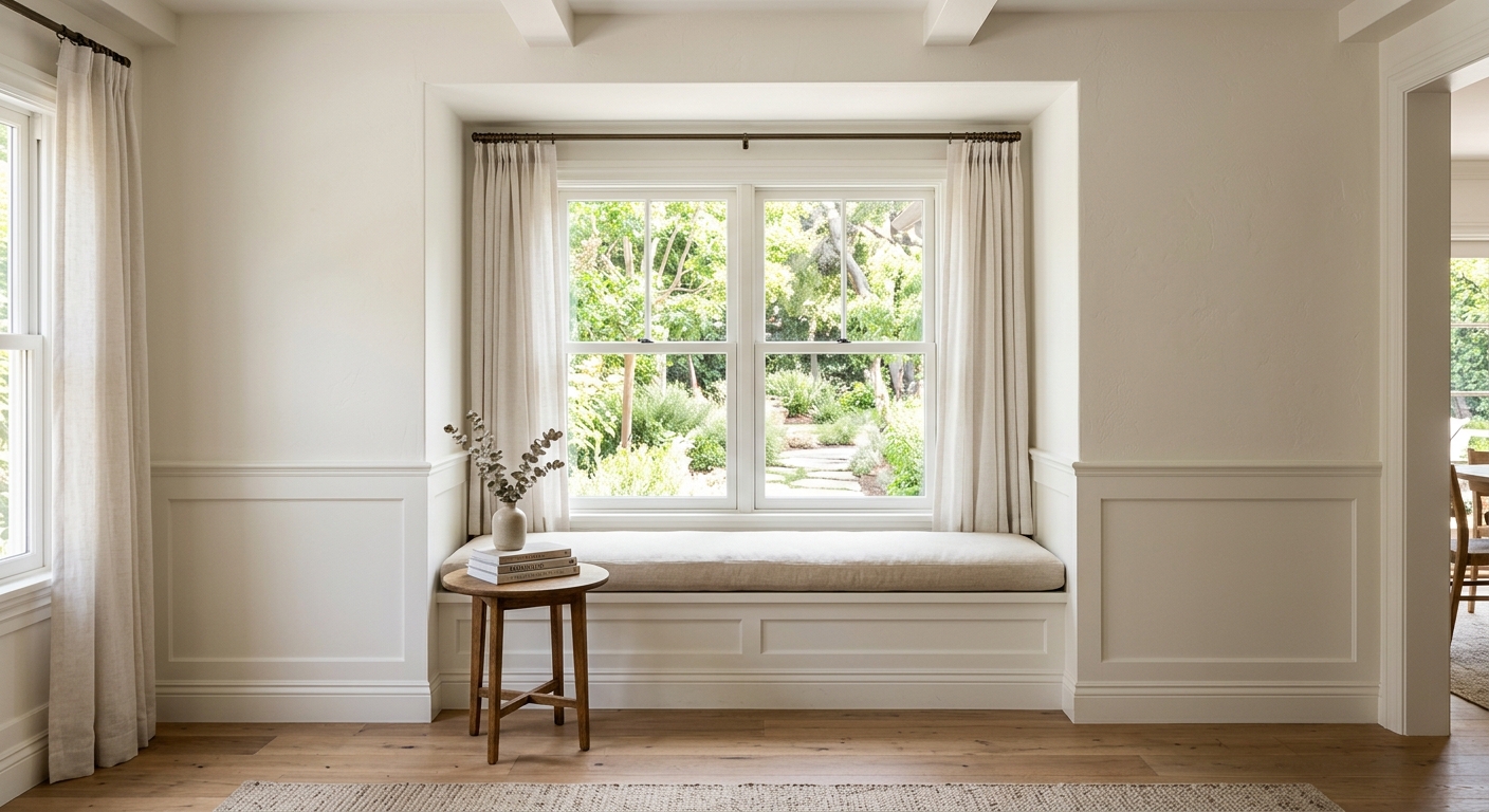
Vertical drapery, tall but narrow mirrors, elongated artwork, and slim lighting can all help guide the eye upward. The keyword is slim. You want elegance, not a room full of visual stilts. In listing images, even subtle vertical cues can make a room feel more composed and more architectural.
Window treatments matter more than people think. Hanging drapery closer to the ceiling and letting it fall cleanly can visually stretch the wall. A narrow mirror near a transition space can create a sense of lift. Even the orientation of art matters. Horizontal gallery walls can flatten the room; one well-placed vertical piece often does more work with less fuss.
3. Keep the color story light, but not lifeless
Low ceilings hate heaviness. Dark, muddy palettes can make the top plane feel like it’s pressing downward, especially in listing photography. But going full sterile-white developer special is not the answer either. Buyers still need warmth.
This is why Vibe Staging matters. It helps tune brightness, contrast, and mood so the room reads as airy, not washed out. Soft neutrals, warm ivories, pale wood tones, and controlled contrast usually outperform trendy dark palettes in rooms with limited vertical drama. The room should feel expensive, not embalmed.
4. Reduce visual interruptions
If the room is already fighting for height, don’t make it fight a dozen other things too. Busy rugs, high-contrast accessories, heavy shelving, and unnecessary decor all create visual stops. Every stop reminds the eye where the ceiling is. A more disciplined staging plan creates smoother sightlines and a stronger sense of openness.
Minimalism helps—but only intelligent minimalism. Buyers still need cues for function and comfort. A living room should still look like a living room, not a meditation chamber designed by an algorithm with commitment issues.

How Magic Motion changes the perception of space
Static images do a decent job of showing a room. Motion does a better job of selling one. Magic Motion is especially effective in low-ceiling spaces because movement can guide attention through depth and light rather than letting the viewer fixate on the room’s shortest dimension.
A subtle cinematic sweep across a staged bedroom or living room can emphasize window light, floor continuity, and furniture spacing. That makes the room feel intentional instead of cramped. Buyers stop thinking, “That ceiling seems low,” and start thinking, “This room feels calm.” Which is a much better thing for them to think while deciding whether to book a showing.
Why this matters for real estate marketing
Most listings are competing in a scroll, not a vacuum. Buyers compare one room against twenty others in the same sitting. A low-ceiling room that looks dull or visually compressed can quietly drag down the perceived value of the whole property. On the other hand, a thoughtfully staged room communicates design intelligence, lifestyle potential, and care.
That’s the part people miss: virtual staging is not just about putting furniture in empty rooms. It’s about controlling first impressions. In real estate technology terms, it is an interface layer between the property and the buyer’s imagination. If that interface is clumsy, the listing underperforms. If it is sharp, the space feels more expensive than its raw image would suggest.
The Staging Wizard approach
At Staging Wizard, we treat awkward architecture like a design puzzle, not a defect. Low ceilings, narrow rooms, weird layouts, dim corners—these are exactly the situations where thoughtful AI virtual staging earns its keep. The best results come from respecting the room’s real constraints and using timeless design principles to redirect attention toward proportion, light, and livability.
That means choosing furniture that leaves breathing room, building a clean visual hierarchy, and using mood adjustments that support the architecture instead of fighting it. Vision Builder handles the strategic styling. Vibe Staging handles the atmosphere. Magic Motion adds the kind of polished movement that makes buyers linger. Not bad for a room that started off looking a little vertically challenged.
Final thought
If a room has low ceilings, pretending otherwise is amateur hour. The smarter move is to stage it so the eye notices elegance before it notices constraint. That is the difference between decoration and strategy. And in listing marketing, strategy wins—preferably before the buyer swipes to the next property.