Micro-Spaces, Maximum Appeal: Using AI Staging to Sell the Corners Buyers Almost Ignore
Every listing has one. That odd little patch of square footage that isn’t quite a room, isn’t quite a closet, and definitely isn’t helping the photo set. It’s the architectural equivalent of a shrug. Buyers see it and think, “Cool… what am I supposed to do with that?” Not ideal. The good news is that AI staging for small unused spaces gives you a way to answer that question before the buyer ever asks it.
This is where virtual staging stops being decorative fluff and starts doing actual strategic work. When a vacant home has an awkward alcove, a dead-end landing, a too-small bonus corner, or that suspiciously purposeless recess by the window, the job is not to throw random furniture at it and pray. The job is to create clarity. Buyers do not pay extra for confusion. They pay for possibility that feels obvious.
That is the whole trick. Or, if we’re staying on brand, the whole wizardry.
Why awkward spaces quietly hurt listing performance
Most agents obsess over kitchens, primary bedrooms, and living rooms. Fair enough. Those rooms pull weight. But the in-between spaces matter more than people admit because they create friction in the buyer’s mental floor plan. If someone has to stop and decode a strange corner, you’ve interrupted the emotional glide path.
Vacant photography makes this worse. An empty niche often reads smaller, colder, and weirder than it really is. The camera is not generous. It flattens nuance and magnifies indecision. A space that could become a reading retreat, compact workstation, meditation corner, pet zone, or stylish drop station just looks unfinished.
That is precisely why AI virtual staging for awkward spaces works so well. It doesn’t merely beautify. It assigns purpose. And purpose sells.
Dead space is rarely dead. It’s just unlabeled.
Designers have known this forever. Buyers respond to environments that explain themselves quickly. When a weird corner is staged with intention, it becomes a feature instead of a liability. Suddenly the listing has a “sunlit reading nook,” a “built-for-hybrid-work alcove,” or a “coffee-and-conversation landing.” Same square footage. Completely different story.
This is where Staging Wizard’s Vision Builder becomes especially useful. Rather than applying one generic furniture set everywhere like some kind of algorithmic yard sale, Vision Builder lets you define the functional identity of the space. Is the likely buyer a remote professional? A young family? A downsizer who wants calm and simplicity? That context matters, because a good micro-space concept should feel inevitable, not gimmicky.
The best staging concept is the one buyers believe instantly
There’s a difference between creativity and showing off. A tiny recess staged as a champagne tasting salon is technically a choice, but probably not one grounded in reality. Strong virtual staging uses scale, proportion, and buyer psychology together. The furniture should fit. The styling should feel livable. The purpose should be legible in about two seconds.
That means compact lounge chairs instead of overstuffed monsters. Wall-mounted desks instead of heavy casegoods. Layered lighting instead of trying to solve every visual problem with a giant floor lamp. In other words: less theatrical nonsense, more practical enchantment.
How to stage awkward nooks without making them look fake
There are a few rules here, and they’re worth following if you want the images to do their job.
1. Respect circulation
If the staging blocks a natural walkway, buyers feel the lie immediately. Even if they can’t articulate why, the image starts to smell suspicious. Good AI staging preserves how a person would actually move through the home.
2. Use function-first furniture
Every item should defend its existence. A slim bench with storage, a petite writing desk, a reading chair with a side table, a low-profile console: these are the kinds of pieces that help small spaces feel intentional. Oversized furniture is visual vandalism.
3. Let mood do some of the heavy lifting
Sometimes the difference between “random corner” and “desirable retreat” is less about objects and more about atmosphere. This is where Vibe Staging earns its keep. Subtle shifts in warmth, contrast, and lighting tone can turn a hard, empty recess into a calm destination. No, mood alone will not save a bad concept. But paired with the right use case, it absolutely sharpens the emotional read.
4. Keep the story specific
Specific sells better than vague. “Flexible bonus area” means almost nothing. “Window-side reading nook with built-in calm” is a much clearer visual promise. The goal is not to list every possible use. It’s to choose the best one for the likely buyer and present it confidently.
Where Magic Motion changes the game
Still images are useful, but weird spaces often benefit from movement because movement explains relationships. A short cinematic sweep can show how the nook connects to the bedroom, hallway, loft, or living area without forcing the viewer to solve a floor-plan puzzle from static frames.
That’s why Magic Motion is more than a flashy extra. In the right listing, it helps prove that a small staged zone belongs naturally within the home. A brief motion sequence can reveal sunlight, adjacency, and scale far better than one heroic still trying to do all the work alone. Buyers don’t just see a cute corner; they understand how it lives inside the house.
And understanding reduces hesitation. Hesitation is expensive.
What kinds of awkward spaces respond best to AI staging?
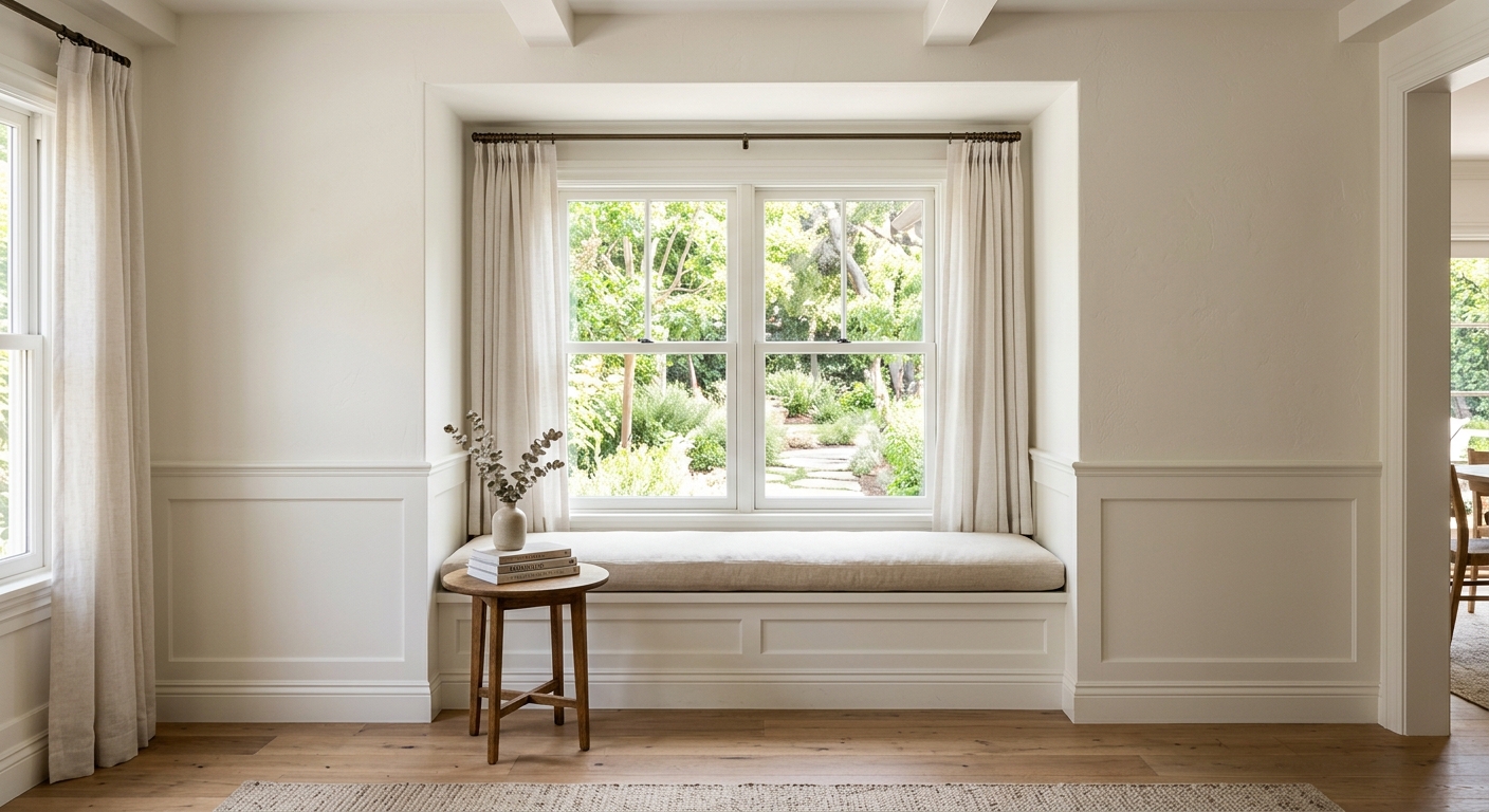
Quite a few, actually. Window alcoves are obvious winners, especially when natural light gives you an excuse to create a reading or wellness moment. Under-stair niches can become storage-forward work zones or design-forward pet stations. Wide landings can read as conversation pockets. Extra area at the end of a hallway can transform into a compact library wall or mini office. Even those strange oversized bedroom corners builders sometimes leave behind can become vanity areas, meditation spots, or nursery-adjacent support zones.
The common thread is this: the space must be given a believable identity that improves the buyer’s understanding of the home. Not just “look, stuff.” Purpose. Flow. Aspiration with a seat height that makes sense.
The business case: small spaces can create outsized ROI

Here’s the part people underestimate. Buyers don’t experience a listing as a spreadsheet of dimensions. They experience it as confidence or doubt. When every visible area feels useful and coherent, the home reads as better designed, better maintained, and more valuable. That can elevate time-on-page, improve image engagement, strengthen showing interest, and support stronger pricing perception.
It is not magic in the fairytale sense. It is magic in the very practical sense of removing mental objections before they form. Staging Wizard’s workflow makes that easier because you can move from vacant image to polished concept quickly, test different directions, and refine the story rather than settling for the first pass. Use Vision Builder to frame the intent, use Vibe Staging to tune the mood, and use Magic Motion when the space needs spatial explanation instead of a single frozen guess.
Final thought: buyers love clarity more than square footage
Not every home has soaring ceilings and magazine-ready symmetry. Some homes have odd corners, eccentric transitions, and little mystery zones that make photographers sigh. Fine. Work with that. The goal is not to pretend the home is something else. The goal is to reveal the best version of what is already there.
That’s what strong AI staging does at its best. It takes a question mark and turns it into a reason to care. And if your listing has an awkward nook doing absolutely nothing, maybe stop calling it a challenge. It might just be your most underemployed selling point.


