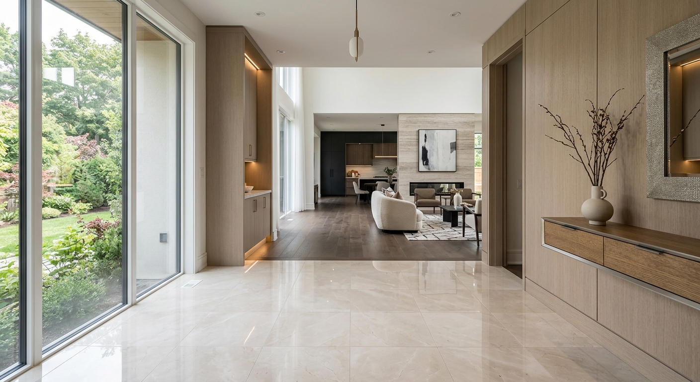
The Invisible Mudroom Advantage: Why Transitional Spaces Sell the Whole House
Everybody loves to fuss over the glamorous rooms. Kitchens get the spotlight. Living rooms get the theatrical fluffing. Primary bedrooms get the soft-focus nonsense. Meanwhile, the mudroom, the drop zone, the little transition hall by the garage door, or that awkward strip of square footage between the entry and the kitchen gets treated like it is spiritually exempt from marketing. That is a mistake. A very normal mistake, granted, but still a mistake.
Buyers do not experience a house as a set of isolated hero shots. They experience flow. They experience friction. They notice whether a home seems to support daily life or quietly sabotage it. Transitional spaces tell that story faster than most agents realize. When those spaces look blank, cramped, or vaguely confusing, the entire property feels less resolved. When they look intentional, the whole home seems smarter, calmer, and more expensive. Funny how that works.
This is exactly where strategic virtual staging earns its keep. Not the cartoonish kind that drops random baskets and a suspiciously shiny fiddle-leaf fig into a hallway. I mean thoughtful visual merchandising that shows how a transitional zone functions. With the right composition, storage cues, and styling restraint, a mudroom becomes evidence that the home is organized before the buyer has even met the pantry.
Why Transitional Spaces Punch Above Their Weight
A mudroom is not just a mudroom. It is shorthand for ease. It suggests where the shoes go, where the backpacks land, where the dog leash lives, and where the visual chaos of ordinary life gets intercepted before it spreads through the house like bad design karma. Even in homes without a formal mudroom, a small landing area or side entry can perform the same psychological job.
In real estate marketing, that matters because buyers are not merely judging square footage. They are judging whether a home feels manageable. Transitional zones act like pressure valves. If the space reads as useful, buyers infer the rest of the house will also be functional. If it reads as dead space, they start mentally subtracting value. No, they do not usually say, “I am concerned about unresolved circulation patterns.” They just leave feeling oddly underwhelmed. Same result.
This is one reason high-performing listing visuals increasingly focus on usability rather than simple prettiness. Design buyers want beauty, of course, but they also want proof. A staged transition zone provides proof that the home has a plan for real life. That is more persuasive than another aggressively beige corner sofa in the family room.
What Buyers Actually Read in a Mudroom Image
1. Storage competence
If a transitional area suggests built-in order, buyers assume the home supports routines. Hooks, cubbies, a bench zone, slim cabinetry, or even a disciplined styling layout signal that everyday clutter has somewhere to go. In virtual staging, this does not mean cramming the image with objects. It means implying capacity without visual noise.
2. Traffic flow
Good staging makes it obvious how people move through the home. A transitional space should feel like a bridge, not a bottleneck. Sightlines matter. Negative space matters. The image should reassure viewers that the route from entry to kitchen, laundry, garage, or living area is intuitive.
3. Emotional decompression
The best homes create a tiny exhale at the threshold between outside life and inside life. This is where texture, lighting, and tone matter. A transitional zone can feel grounded, warm, and competent without looking fussy. That emotional cue ripples outward. Buyers begin to read the home as calm.
How to Stage a Transitional Space Without Overplaying It
The trick is suggestion, not spectacle. Transitional areas are support characters. If you stage them like the star of a design show, the image becomes self-conscious and weird. A few principles keep the result persuasive.
Lead with architecture
If the room has beadboard, millwork, lockers, a bench niche, durable flooring, or a useful wall plane, emphasize that first. Staging should clarify the architecture, not bury it under decorative nonsense.
Use restrained props
One tote. A pair of neatly placed shoes. A folded throw. Maybe a ceramic bowl for keys if the scene warrants it. That is usually enough. The point is to imply use while preserving clarity. Virtual staging is at its strongest when it edits as much as it adds.
Match the home’s design language
A sleek contemporary listing should not suddenly sprout rustic farmhouse hooks because someone panicked and reached for “cozy.” This is where Vision Builder is especially valuable. It lets you calibrate staging choices to the target buyer, architectural style, and the role each room plays in the narrative of the home.
Where Technology Makes the Difference
Modern buyers scroll fast, and most listings get judged long before a showing happens. That means every image has to do actual work. This is where advanced AI virtual staging tools separate useful marketing from glorified decoration.
With Vibe Staging, you can tune the emotional register of a transition space without inventing a fantasy. A brighter, airy palette can make a compact side entry feel clean and optimistic. A slightly richer tonal treatment can make custom millwork read more premium. Tiny changes in lighting balance and mood can push a space from forgettable to intentional.
Magic Motion adds another layer. Transitional spaces often make more sense in sequence than in a single static frame. A subtle motion clip that glides from the entry to the living area can communicate flow far better than a lone still image. Instead of asking a buyer to decode the floor plan from fragments, you let them feel the logic of the home. Astonishing concept, really: showing the thing actually working.
And because these tools are fast, agents and photographers can treat secondary spaces as assets rather than afterthoughts. That changes listing strategy. Suddenly the small corridor by the garage is not dead air in the photo set. It is supporting evidence that the house lives well.
When a Mudroom Matters Most
Family-oriented homes
Buyers shopping for functional family homes are hypersensitive to clutter management, whether they say so or not. A well-staged mudroom telegraphs sanity.
Luxury homes
In higher-end listings, transitional spaces reinforce the impression of custom planning. If a luxury property lacks definition in these zones, the finish quality elsewhere loses some of its authority.
Smaller homes and condos
When square footage is tighter, every inch must justify itself. Showing an entry sequence with purposeful storage can make the entire home feel more efficient and therefore more valuable.
The Real Sales Lesson
People do not buy rooms. They buy a way of moving through life. That is why transitional spaces matter. They are tiny operational promises embedded in the floor plan. Ignore them, and the listing feels less complete. Stage them intelligently, and the whole house gains coherence.
So yes, by all means, make the kitchen sparkle. Give the living room its hero shot. But if you want buyers to trust the home, show them where real life lands when someone walks through the door. The humble mudroom may not be glamorous, but it is often the room quietly persuading people that the rest of the house has its act together.
And in property marketing, that kind of invisible competence sells. Not with fireworks. With confidence. Which, as it happens, is usually the more profitable form of magic.